Choosing a Font for Clean and Reliable Machine Applique
A font can change the entire appearance of an applique design, but appearance is only one part of the decision. In machine embroidery, every letter must also work as a stitch path. If the font contains details that are too small or difficult to cut, the finished design may not look like the original artwork.
Look Beyond the Screen
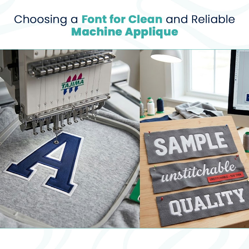
When selecting a font, imagine how each letter will be created from fabric. Rounded shapes, open counters, and balanced spacing usually make the production process easier.
This is also where understanding the types of embroidery digitizing becomes useful. Different lettering styles may need different approaches when they are converted into stitch instructions.
For applique lettering, check:
How the fabric pieces will be cut
Where the placement line will run
How the border will cover the fabric edge
Whether small details can hold their shape
How the letters will look at the actual sewing size
Match the Font to the Project
A playful font may suit children's clothing, while a clean block style may work better for uniforms or business apparel. Decorative fonts can be useful for special projects, but they need enough space for the applique material and finishing stitches.
The garment also matters. A font that works well on a large jacket back may not be practical for a small chest design.
Keep Small Letters Simple
Small applique letters are more challenging because there is less space for fabric and stitching. Tight spaces can close up, and thin strokes can become difficult to define.
For smaller projects, choose letters with:
Strong outer shapes
Open spaces
Moderate thickness
Limited decorative details
Always Check a Sample
A digital preview cannot show every production issue. A stitch-out reveals how the fabric reacts, whether the edges are covered properly, and whether the letters remain readable.
I prefer testing a font at the final size before approving a larger run. This gives the digitizer a chance to adjust stitch direction, borders, spacing, and other details.
A successful applique font is one that works in production, not just one that looks good on a computer screen.
VISIT: https://note09663.tistory.com/2